
Café branding
A café in two scripts
Brand identity and a forty-page system for a coffee shop in Phnom Penh, drawn in Khmer and Latin at equal weight.
- Relationship
- for the café
- Scope
- Identity, type, palette, guidelines
- Status
- Delivered, unadopted
The ask
A coffee shop opening in Phnom Penh needed an identity that worked in two scripts — Khmer for the room it stands in, Latin for the internet it lives on. Most brands here treat the Khmer as a translation: set in whatever font is to hand and bolted underneath the real logo.
What we found
Khmer is not Latin with different shapes. It stacks. Subscript consonants hang below the baseline, diacritics climb above it, and the vertical space a word occupies changes with the word. Set beside a Latin wordmark tuned to a tidy x-height, it floats, collides, or gets shrunk until it reads as a footnote.
The idea
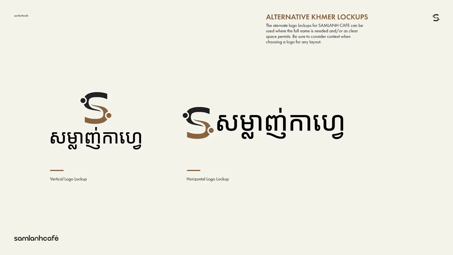
Two scripts, one voice. Neither of them a translation.
The system
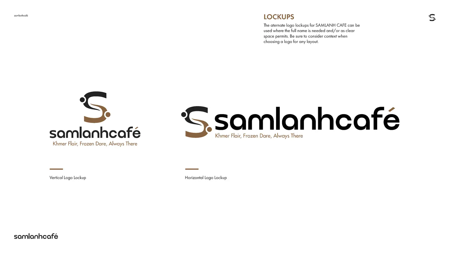
One monogram, two lockups — vertical and horizontal — each drawn so the Khmer and the Latin carry equal weight rather than equal size. Qurova sets the headline, Futura PT the line beneath it.
The palette
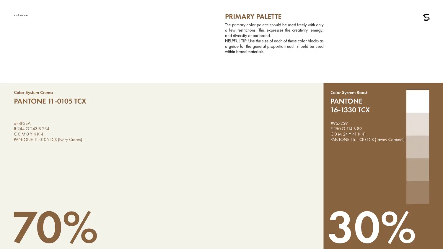
Named in the language of the product rather than the language of design: Crema, Roast, Grounds, Espresso, Canvas. Specified to Pantone, in a 70/30 proportion. A shop manager can apply it without knowing what a tint is.
The book
Forty pages. Lockups, clear space, restrictions, colour combinations, four pages of type, art direction for social, and applications. A guideline is finished when someone who has never met you can use it correctly.
Where it stands
Delivered complete. Never taken to market. It is published here as a system rather than a launch, because the thinking holds whether or not the doors opened on it.
Brand identity, typographic system, palette and forty-page guidelines.MONISM Studio, Phnom Penh.