
Rebrand
Destin
Rebrand, typographic system and stationery suite for a personal styling service in Phnom Penh.
- Relationship
- for Destin
- Scope
- Rebrand, type, stationery
- Status
- Adopted and in use
The ask
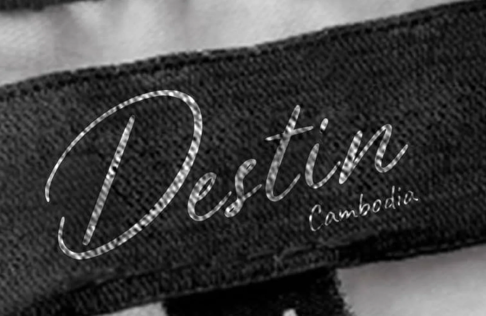
Destin had run the same script wordmark for years. He is a tailor, not a brand owner, and nobody had ever explained to him what an identity was actually for. Then he moved premises.
What we found
Nothing was failing. The old wordmark had served him for years and would have served a year longer. What changed was the room. A business gets one moment when it can become something else without confusing anybody, and relocation is that moment — customers are already recalibrating, so the mark can move while they are looking.
The idea
The new room was the brief.
The mark
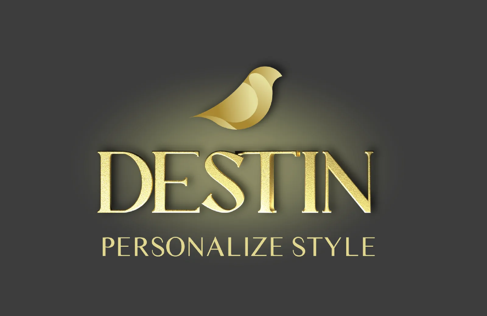
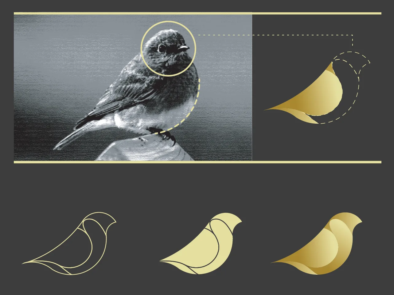
A bluebird, constructed on the golden ratio, its curves taken from the anatomy of the bird rather than applied to it. Solid and weighted, certain without being insistent — because a stylist's mark must never out-dress the client wearing it.
The system
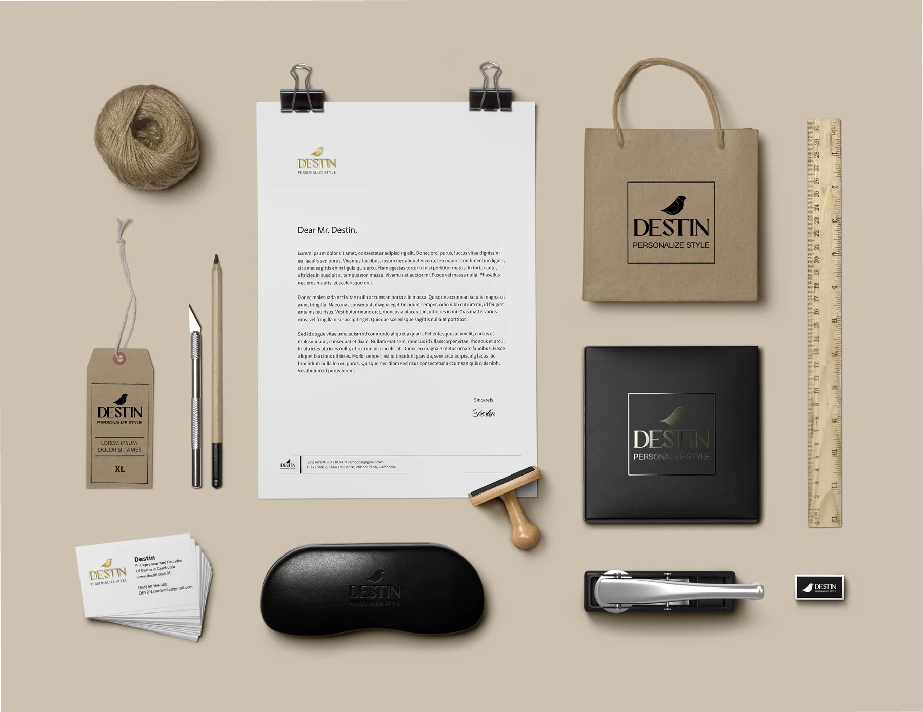
One mark, drawn for every substrate it would meet — gradient gold for print, solid black for a rubber stamp, reversed for embossed boxes, single-weight for a woven label. Systems fail at the smallest size, so that is where the drawing starts.
The suite
Letterhead, business cards, swing tags, paper bags, boxes, stamp and packaging. Ahganirya for the wordmark, Times Sans Serif beneath. Three colours: pale gold, charcoal and a deeper gold for weight.
Where it stands
Adopted and carried across the suite. The shop moved, the mark moved with it, and he is still tailoring.
Brand identity, typographic system and stationery suite for Destin.MONISM Studio, Phnom Penh.